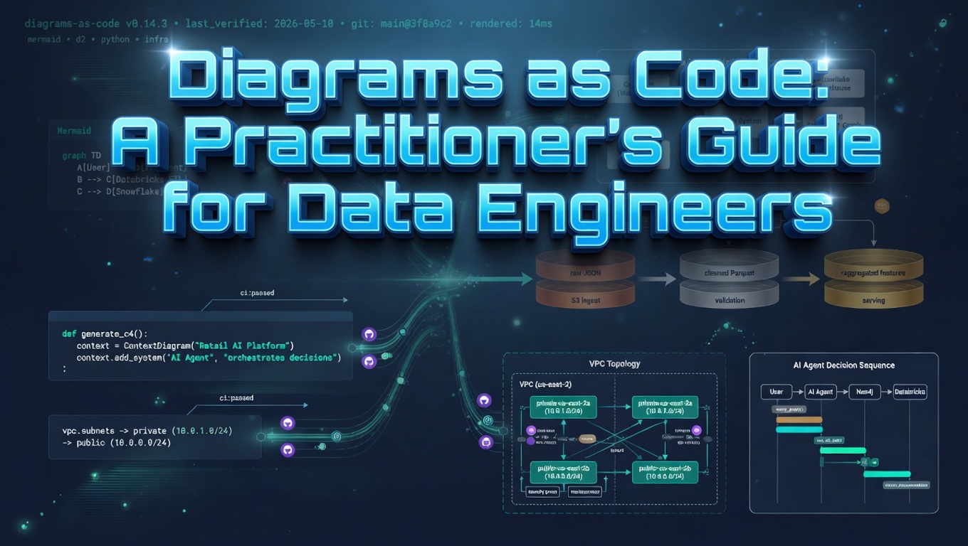
TL;DR
- Hand-drawn diagrams in Lucidchart, Visio, draw.io or Confluence rot because they live outside the codebase, cannot be diffed, and have no compiler to flag when they go stale. Diagrams as code closes all three gaps by treating the text source as truth and the rendered image as a build artefact.
- Pick by the question you are answering, not by taste. Mermaid for embedded docs and anything that has to render in GitHub. D2 for aesthetically polished architecture with real cloud icons. Python
diagramsfor AWS-heavy decks. PlantUML or Structurizr when you need formal UML or the C4 model. - The conventions that make trust explicit: co-locate diagrams with the code they describe, add a metadata header with
last_verifiedandnext_review_due, encode confidence visually ( verified / stale / proposed ), pair each non-obvious diagram with an ADR, and render in CI. - The highest-leverage move is to generate diagrams from the system itself - Terraform state, lineage graphs, dbt manifests, Airflow DAGs. A generated diagram is provably current by construction, which is a much stronger guarantee than “I reviewed it last quarter.”
If you have ever opened a Confluence page from two years ago and wondered whether the architecture it shows is still real, you have already met the problem this post is trying to fix. Hand-drawn diagrams in Lucidchart, Visio, draw.io or PowerPoint share three failure modes that no amount of governance ever quite eliminates. They live somewhere your code does not, so nobody updates them in the same PR that changes the system. They cannot be diffed, reviewed, or merged. And they rot silently, because there is no compiler error for “this picture is now a lie.”
Diagrams as code is the discipline that closes all three gaps. You write a small text file ( .d2, .mmd, .puml, or a Python script ), commit it next to the code it describes, render it in CI, and treat the rendered image as a build artefact. The text is the source of truth and the picture is the output. Everything else in this post is in service of making that loop work in production.
This is the version of the playbook I would hand to a senior data engineer who has been asked to “fix our architecture docs” and wants a concrete starting point rather than a tool review.
Pick the tool by job, not by taste
There is no single best tool. Pick by the question you are trying to answer.
| Tool | Best for | Output | Renders in GitHub? |
|---|---|---|---|
| Mermaid | Embedded docs, README diagrams, sequence and flow and ER diagrams | SVG, PNG | Native |
| D2 | Aesthetically polished architecture diagrams | SVG, PNG, PDF | No, render in CI |
Python diagrams |
Cloud architecture with real AWS, GCP and Azure icons | PNG, SVG | No, render in CI |
| PlantUML | UML, sequence, ER, deployment | SVG, PNG | Via proxy |
| Structurizr DSL / Likec4 | C4 model with multiple synchronised views | SVG, PNG, JSON | No |
| Graphviz / DOT | Algorithmically generated graphs and lineage | SVG, PNG, PDF | No |
| Excalidraw + excalidraw-cli | Sketchy whiteboard-style diagrams | PNG, SVG | No |
If you only learn one of these, learn Mermaid. It renders directly in GitHub, GitLab, Bitbucket, Notion and Obsidian, which means a diagram you write today is readable wherever the team already reads code. If you want diagrams that look like a designer touched them, learn D2. For AWS-heavy architecture decks with proper provider icons, Python diagrams is unbeatable.
Match the diagram to the question
A surprising amount of poor technical communication comes from reaching for “an architecture diagram” when the audience actually wants a different view. The C4 model and a small set of canonical diagram types cover almost every real need.
| You want to communicate… | Use a… |
|---|---|
| How the system fits in the wider world | C4 Context diagram |
| The major building blocks inside the system | C4 Container diagram |
| The runtime interaction between components for one scenario | Sequence diagram |
| Data movement and transformation stages | ETL / data flow diagram (DAG) |
| Network topology, subnets, security boundaries | Network / deployment diagram |
| State transitions of an entity | State diagram |
| Decision logic in a process | Flowchart |
| Entity relationships in a database | ER diagram |
| Time-bound delivery plan | Gantt chart |
| Lineage and dependencies | DAG, usually auto-generated |
Pick one. If the diagram is trying to answer two questions at once, the diagram is wrong and the fix is to split it.
Worked examples
The five examples below are shown in both Mermaid and D2 so you can compare the syntax and output side by side. Mermaid renders natively in GitHub; D2 needs a CLI render step but produces noticeably more polished output, especially when you pull in real cloud icons.
1. C4 Context
This is the top-level “what is this system and who touches it” view. It should fit on one page and contain no implementation detail. If your context diagram has database names on it, it is not a context diagram.
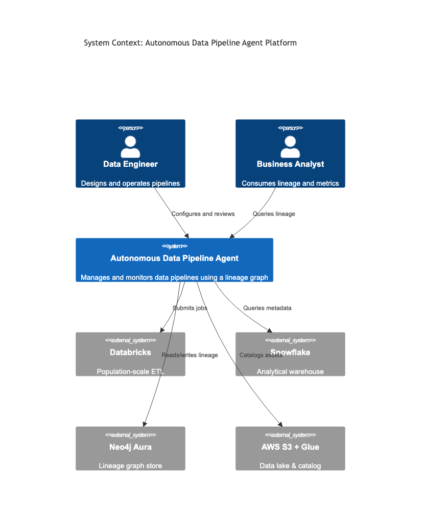
C4Context
    title System Context: Autonomous Data Pipeline Agent Platform

    Person(de, "Data Engineer", "Designs and operates pipelines")
    Person(ba, "Business Analyst", "Consumes lineage and metrics")

    System(adpa, "Autonomous Data Pipeline Agent", "Manages and monitors data pipelines using a lineage graph")

    System_Ext(databricks, "Databricks", "Population-scale ETL")
    System_Ext(snowflake, "Snowflake", "Analytical warehouse")
    System_Ext(neo4j, "Neo4j Aura", "Lineage graph store")
    System_Ext(aws, "AWS S3 + Glue", "Data lake & catalog")

    Rel(de, adpa, "Configures and reviews")
    Rel(ba, adpa, "Queries lineage")
    Rel(adpa, databricks, "Submits jobs")
    Rel(adpa, snowflake, "Queries metadata")
    Rel(adpa, neo4j, "Reads/writes lineage")
    Rel(adpa, aws, "Catalogs assets")
The same context in D2. D2 has no native C4 syntax, so the convention is to use the person shape for actors, colour the focal system distinctly, and grey out external systems.
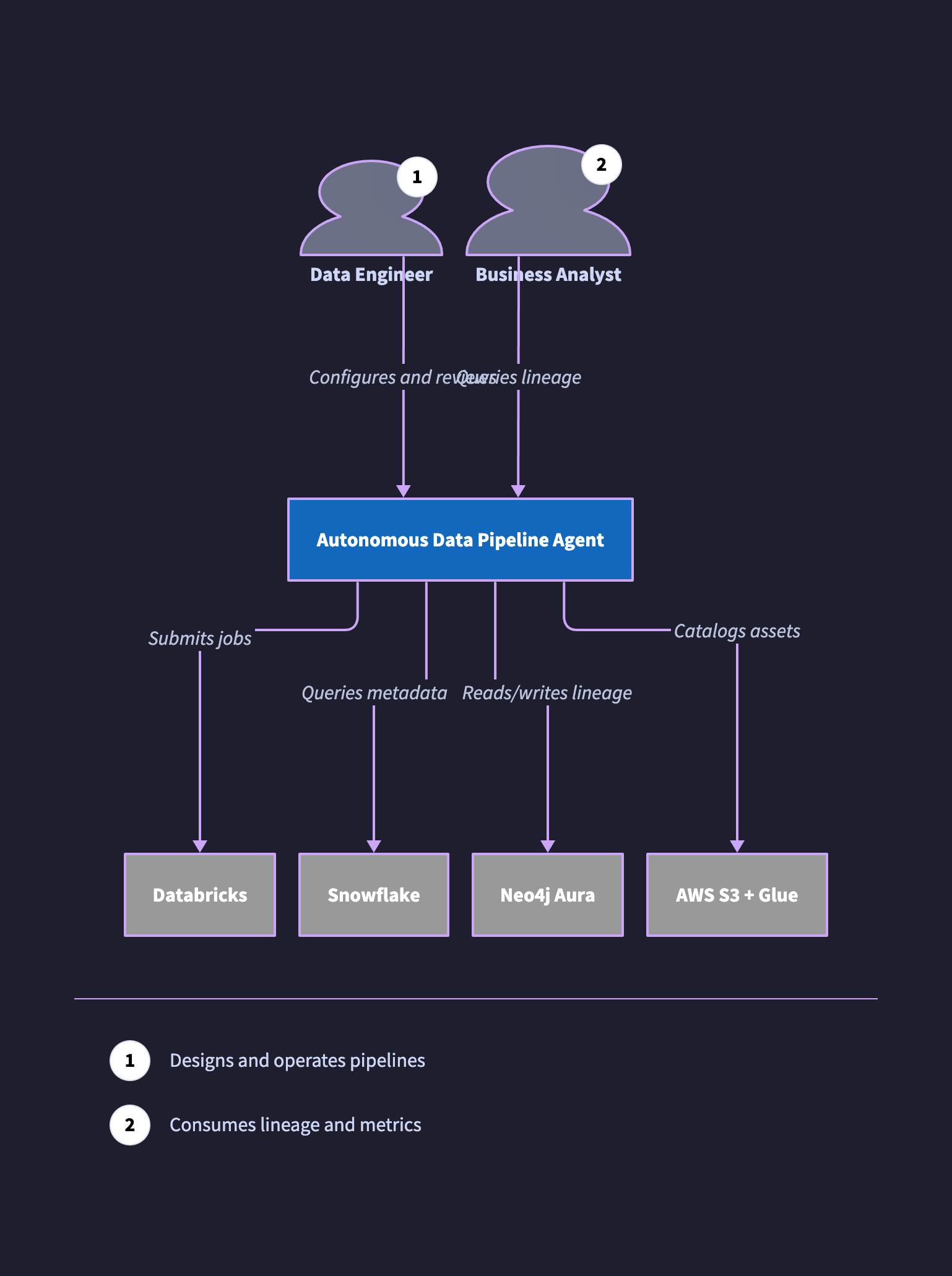
direction: down

de: Data Engineer {
  shape: person
  tooltip: Designs and operates pipelines
}
ba: Business Analyst {
  shape: person
  tooltip: Consumes lineage and metrics
}

adpa: Autonomous Data Pipeline Agent {
  style.fill: "#1168BD"
  style.font-color: white
  style.bold: true
}

databricks: Databricks { style.fill: "#999999"; style.font-color: white }
snowflake: Snowflake { style.fill: "#999999"; style.font-color: white }
neo4j:     Neo4j Aura { style.fill: "#999999"; style.font-color: white }
aws:       AWS S3 + Glue { style.fill: "#999999"; style.font-color: white }

de -> adpa: Configures and reviews
ba -> adpa: Queries lineage
adpa -> databricks: Submits jobs
adpa -> snowflake: Queries metadata
adpa -> neo4j: Reads/writes lineage
adpa -> aws: Catalogs assets
2. ETL pipeline / data flow
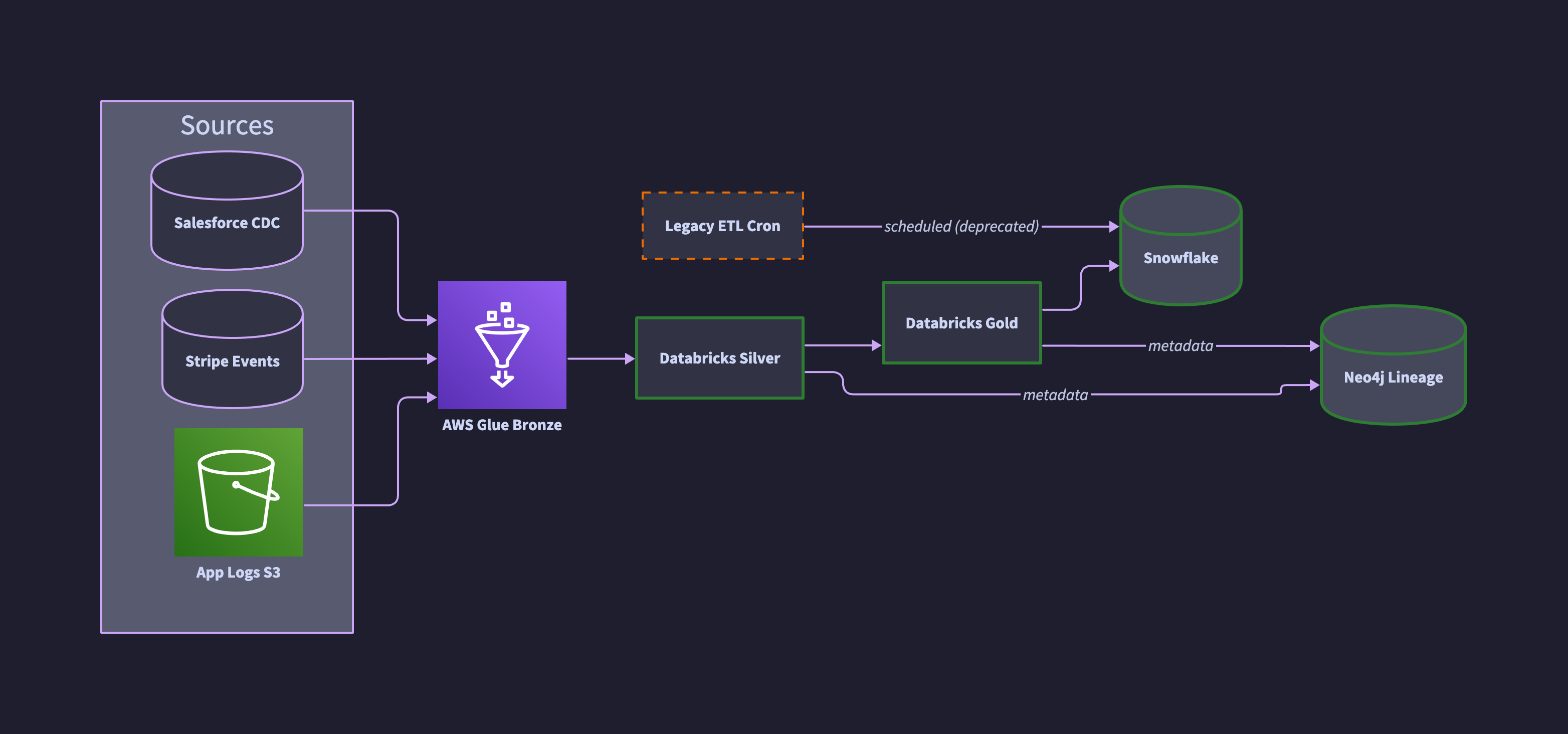
The convention for data flow is left-to-right, sources on the left, sinks on the right, transformations in the middle. Labelling the medallion layers ( bronze, silver, gold ) makes the intent of each stage explicit and short-circuits the inevitable “what does this box do” review comment.
Notice the dashed orange box. That is a legacy job we know is still running but plan to retire. Encoding confidence visually saves a thousand wiki comments. More on this convention below.
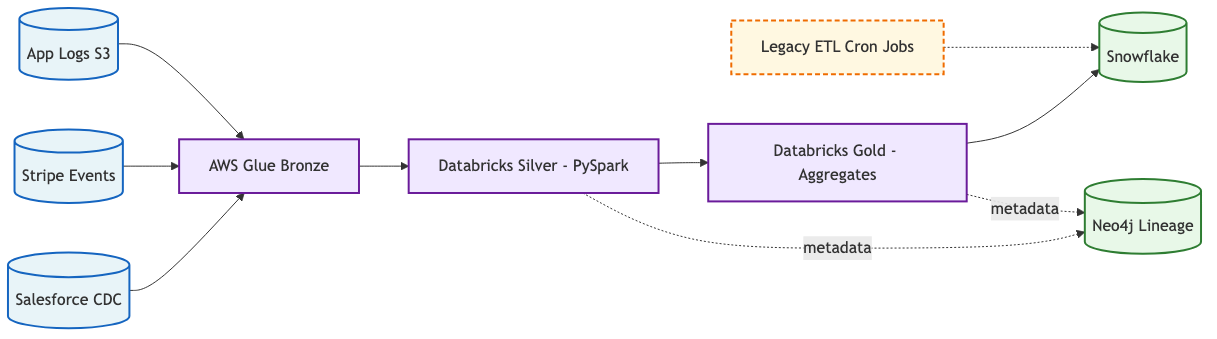
flowchart LR
    classDef source fill:#E8F4F8,stroke:#1565C0,stroke-width:2px
    classDef compute fill:#F0E8FF,stroke:#6A1B9A,stroke-width:2px
    classDef store fill:#E8F8E8,stroke:#2E7D32,stroke-width:2px
    classDef warn fill:#FFF8E1,stroke:#EF6C00,stroke-width:2px,stroke-dasharray:5 3

    S1[(Salesforce CDC)]:::source
    S2[(Stripe Events)]:::source
    S3[(App Logs S3)]:::source
    L[AWS Glue Bronze]:::compute
    C[Databricks Silver - PySpark]:::compute
    G[Databricks Gold - Aggregates]:::compute
    SF[(Snowflake)]:::store
    NEO[(Neo4j Lineage)]:::store
    LK[Legacy ETL Cron Jobs]:::warn

    S1 --> L
    S2 --> L
    S3 --> L
    L --> C --> G --> SF
    C -.->|metadata| NEO
    G -.->|metadata| NEO
    LK -.-> SF
The same pipeline in D2 with real AWS icons pulled from Terrastruct, confidence classes for verified vs stale components, and ELK layout for clean left-to-right flow.
direction: right

classes: {
  verified: { style.stroke: "#2E7D32"; style.stroke-width: 3 }
  stale:    { style.stroke: "#EF6C00"; style.stroke-dash: 4 }
}

sources: Sources {
  salesforce: Salesforce CDC { shape: cylinder }
  stripe: Stripe Events { shape: cylinder }
  logs: App Logs S3 {
    icon: https://icons.terrastruct.com/aws%2FStorage%2FAmazon-Simple-Storage-Service-S3.svg
    shape: image
  }
}

bronze: AWS Glue Bronze {
  icon: https://icons.terrastruct.com/aws%2FAnalytics%2FAWS-Glue.svg
  shape: image
}

silver: Databricks Silver { class: verified }
gold:   Databricks Gold   { class: verified }

snowflake: Snowflake { shape: cylinder; class: verified }
neo4j:     Neo4j Lineage { shape: cylinder; class: verified }

legacy: Legacy ETL Cron { class: stale }

sources.salesforce -> bronze
sources.stripe     -> bronze
sources.logs       -> bronze
bronze -> silver -> gold -> snowflake
silver -> neo4j: metadata
gold   -> neo4j: metadata
legacy -> snowflake: scheduled (deprecated)
3. Network / deployment
Networks need explicit boundaries: VPC, subnet, account, region. Mermaid subgraphs map cleanly to these. Always label which subnets are public and which are private, because that is almost always the actual question the reviewer is trying to answer.
flowchart TB
    subgraph Internet
        U[Users]
    end
    subgraph AWS[AWS Account - eu-west-2]
        CF[CloudFront + WAF]
        ALB[Application LB]
        subgraph PUB[Public Subnet]
            NAT[NAT Gateway]
            BAST[Bastion]
        end
        subgraph PRIV[Private Subnet - App]
            APP1[ECS Task 1]
            LAMBDA[Lambda Lineage API]
        end
        subgraph DATA[Private Subnet - Data]
            NEO[(Neo4j)]
            RDS[(RDS Postgres)]
        end
    end
    U --> CF --> ALB --> APP1
    APP1 --> LAMBDA --> NEO
    APP1 --> RDS
    APP1 --> NAT --> Internet
The same topology in D2. Container nesting is one of D2’s strongest features: account, public subnet, private subnets and data tier are all proper containers rather than subgraph labels.
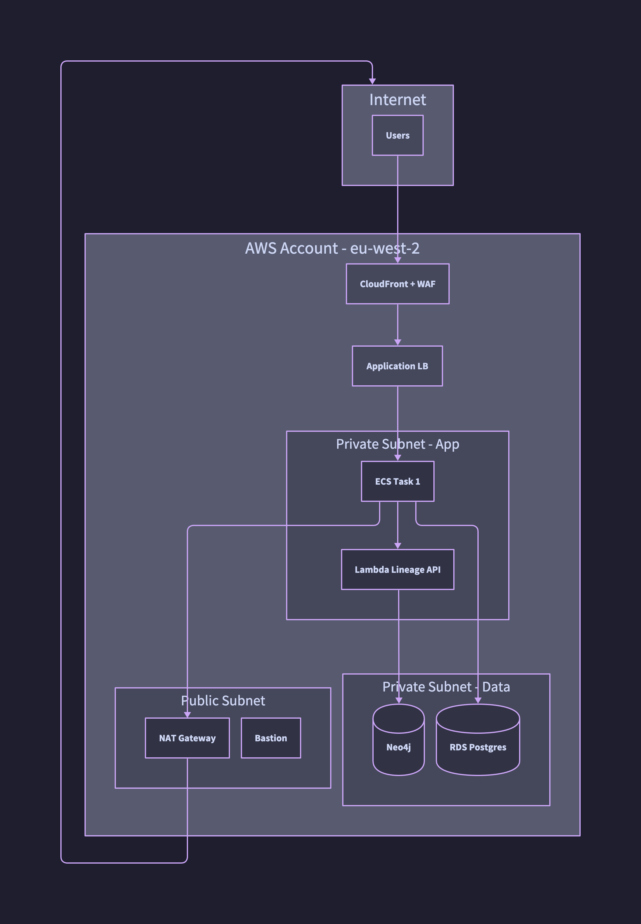
direction: down

internet: Internet {
  users: Users
}

aws: AWS Account - eu-west-2 {
  cf: CloudFront + WAF
  alb: Application LB

  pub: Public Subnet {
    nat: NAT Gateway
    bast: Bastion
  }

  priv: Private Subnet - App {
    app1: ECS Task 1
    lambda: Lambda Lineage API
  }

  data: Private Subnet - Data {
    neo4j: Neo4j { shape: cylinder }
    rds: RDS Postgres { shape: cylinder }
  }
}

internet.users -> aws.cf
aws.cf -> aws.alb
aws.alb -> aws.priv.app1
aws.priv.app1 -> aws.priv.lambda
aws.priv.lambda -> aws.data.neo4j
aws.priv.app1 -> aws.data.rds
aws.priv.app1 -> aws.pub.nat
aws.pub.nat -> internet
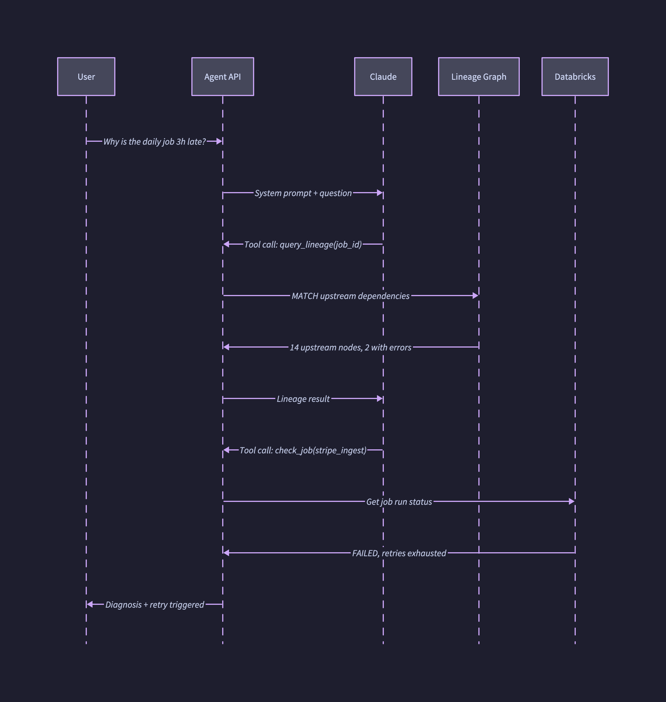
4. Sequence diagram for an AI agent
Sequence diagrams are the right tool when the question is “what happens, in what order, between which actors.” For AI agent flows specifically they are invaluable, because they make tool-use loops visible in a way that prose never quite does.
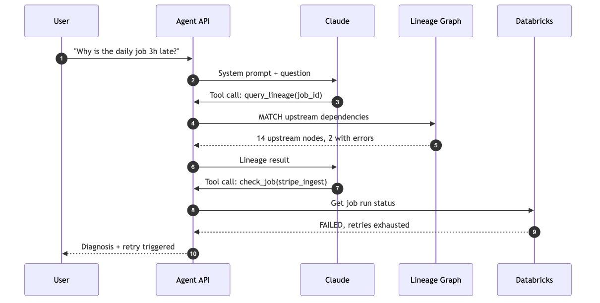
sequenceDiagram
    autonumber
    participant U as User
    participant API as Agent API
    participant LLM as Claude
    participant LG as Lineage Graph
    participant DB as Databricks

    U->>API: "Why is the daily job 3h late?"
    API->>LLM: System prompt + question
    LLM->>API: Tool call: query_lineage(job_id)
    API->>LG: MATCH upstream dependencies
    LG-->>API: 14 upstream nodes, 2 with errors
    API->>LLM: Lineage result
    LLM->>API: Tool call: check_job(stripe_ingest)
    API->>DB: Get job run status
    DB-->>API: FAILED, retries exhausted
    API-->>U: Diagnosis + retry triggered
The same flow in D2. Setting shape: sequence_diagram at the top of the file switches the entire diagram into sequence mode and lets you express the interaction as ordered edges between participants.
shape: sequence_diagram

u:   User
api: Agent API
llm: Claude
lg:  Lineage Graph
db:  Databricks

u   -> api: Why is the daily job 3h late?
api -> llm: System prompt + question
llm -> api: Tool call: query_lineage(job_id)
api -> lg:  MATCH upstream dependencies
lg  -> api: 14 upstream nodes, 2 with errors
api -> llm: Lineage result
llm -> api: Tool call: check_job(stripe_ingest)
api -> db:  Get job run status
db  -> api: FAILED, retries exhausted
api -> u:   Diagnosis + retry triggered
5. Confidence-coded diagram
This is the technique most teams skip and most often need. Colour and stroke style encode how much you trust each component to be current. A diagram that is honest about its own confidence is far more useful than one that pretends every box was verified yesterday.
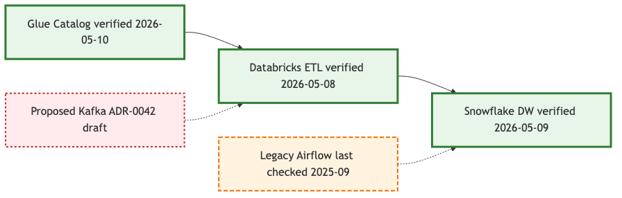
flowchart LR
    classDef verified fill:#E8F5E9,stroke:#2E7D32,stroke-width:3px
    classDef stale fill:#FFF3E0,stroke:#EF6C00,stroke-width:2px,stroke-dasharray:6 3
    classDef proposed fill:#FFEBEE,stroke:#C62828,stroke-width:2px,stroke-dasharray:3 3

    A[Glue Catalog verified 2026-05-10]:::verified
    B[Databricks ETL verified 2026-05-08]:::verified
    C[Snowflake DW verified 2026-05-09]:::verified
    D[Legacy Airflow last checked 2025-09]:::stale
    E[Proposed Kafka ADR-0042 draft]:::proposed

    A --> B --> C
    D -.-> C
    E -.-> B
The same convention in D2. Classes are defined once at the top and applied with class: on each node, which keeps the visual vocabulary consistent across every diagram in the repo.
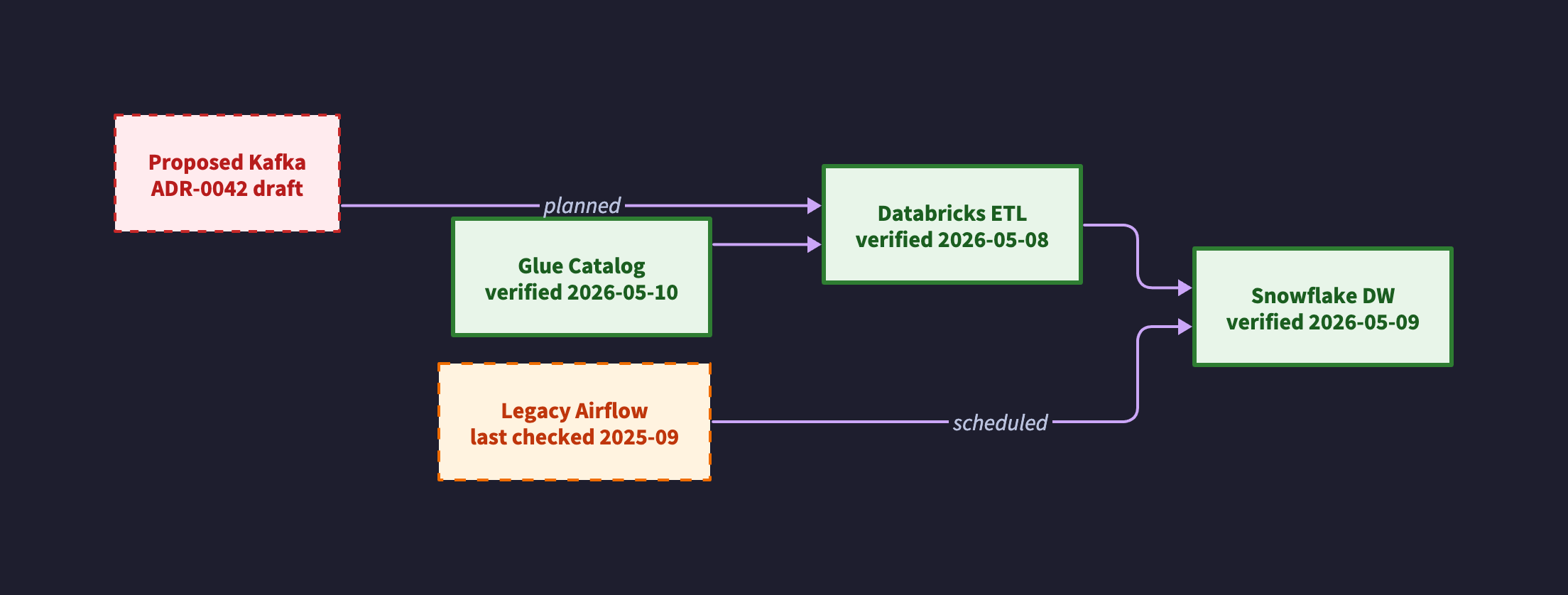
direction: right

classes: {
  verified: {
    style.stroke: "#2E7D32"
    style.stroke-width: 3
    style.fill: "#E8F5E9"
    style.font-color: "#1B5E20"
  }
  stale: {
    style.stroke: "#EF6C00"
    style.stroke-width: 2
    style.stroke-dash: 4
    style.fill: "#FFF3E0"
    style.font-color: "#BF360C"
  }
  proposed: {
    style.stroke: "#C62828"
    style.stroke-width: 2
    style.stroke-dash: 3
    style.fill: "#FFEBEE"
    style.font-color: "#B71C1C"
  }
}

a: "Glue Catalog\nverified 2026-05-10"     { class: verified }
b: "Databricks ETL\nverified 2026-05-08"   { class: verified }
c: "Snowflake DW\nverified 2026-05-09"     { class: verified }
d: "Legacy Airflow\nlast checked 2025-09"  { class: stale }
e: "Proposed Kafka\nADR-0042 draft"        { class: proposed }

a -> b -> c
d -> c: scheduled
e -> b: planned
The visual convention I would suggest is simple. Solid green is verified within the review window, dashed orange is stale or being retired, dashed red is proposed and not yet built. Reviewers see the diagram’s own self-assessment at a glance and can immediately tell which parts to trust.
Rendering D2
All the D2 examples above are rendered with the same command. Pin the layout engine and theme so output is reproducible across machines.
d2 --layout=elk --theme=200 pipeline.d2 pipeline.svg
d2 --layout=elk --theme=200 pipeline.d2 pipeline.png
A Python diagrams example
For AWS-heavy architecture decks, nothing beats real provider icons. Python diagrams uses Graphviz under the hood and lets you express infrastructure in code that is also readable by anyone who has used PyTorch or Airflow.
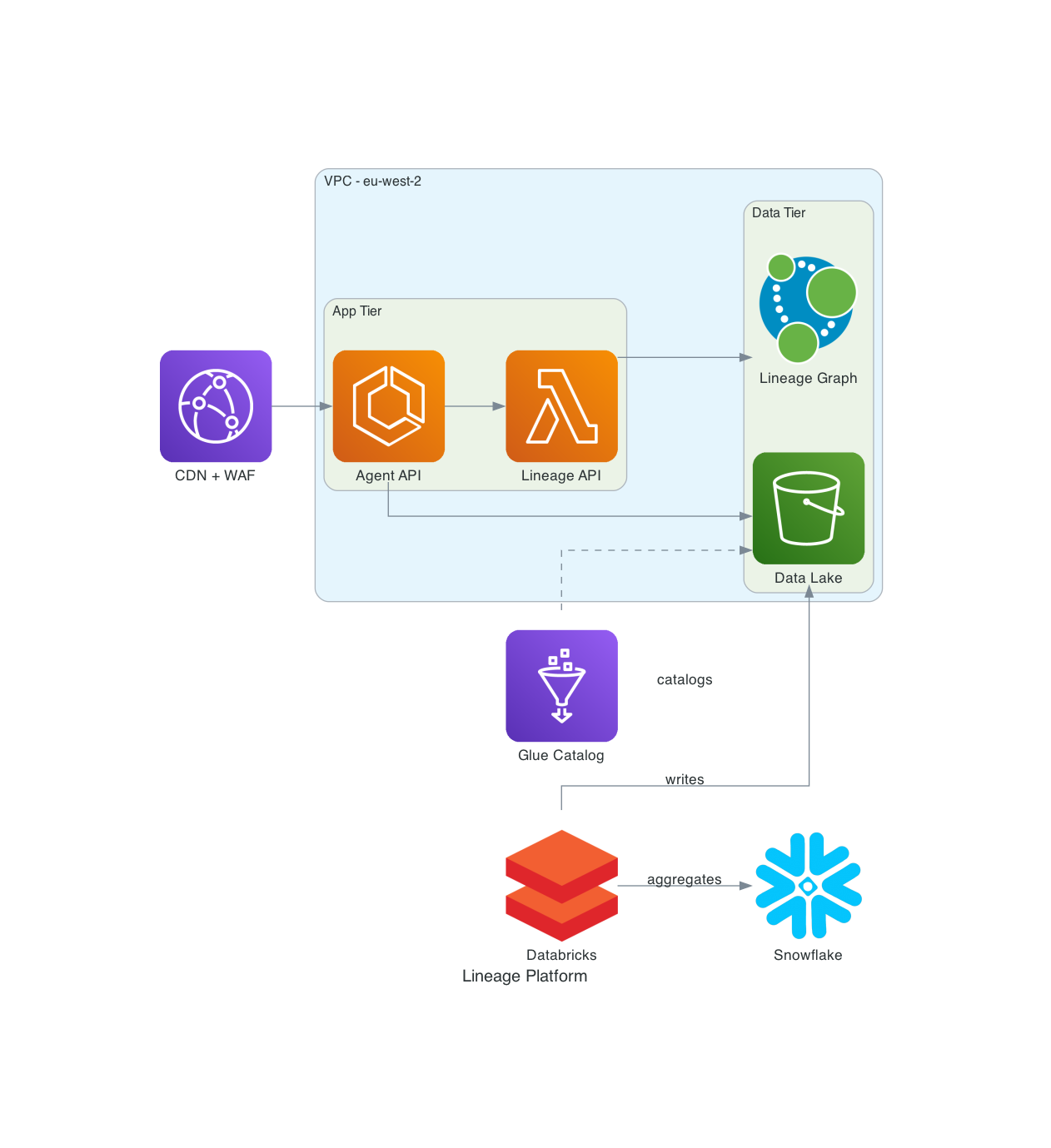
from diagrams import Diagram, Cluster, Edge
from diagrams.aws.compute import Lambda, ECS
from diagrams.aws.storage import S3
from diagrams.aws.analytics import Glue
from diagrams.aws.network import CloudFront, ELB
from diagrams.onprem.analytics import Databricks
from diagrams.onprem.database import Neo4J
from diagrams.saas.analytics import Snowflake

with Diagram("Lineage Platform", filename="lineage_platform", show=False, direction="LR"):
    cdn = CloudFront("CDN + WAF")
    with Cluster("VPC - eu-west-2"):
        with Cluster("App Tier"):
            api = ECS("Agent API")
            lin = Lambda("Lineage API")
        with Cluster("Data Tier"):
            graph = Neo4J("Lineage Graph")
            lake = S3("Data Lake")
    glue = Glue("Glue Catalog")
    spark = Databricks("Databricks")
    dw = Snowflake("Snowflake")

    cdn >> api >> lin >> graph
    api >> lake
    spark >> Edge(label="writes") >> lake
    spark >> Edge(label="aggregates") >> dw
    glue >> Edge(style="dashed", label="catalogs") >> lake
python diagram.py produces lineage_platform.png. Commit both.
Versioning and source-of-truth conventions
A diagram you cannot trust is worse than no diagram, because it actively misleads. The conventions below are what make trust explicit rather than implicit.
File layout
your-repo/
├── docs/
│   └── diagrams/
│       ├── README.md                      # index of all diagrams
│       ├── platform-context.d2            # C4 context (top-level)
│       ├── platform-context.svg           # rendered
│       ├── ingest-pipeline.mmd
│       ├── ingest-pipeline.png
│       ├── network-prod.d2
│       └── adrs/
│           ├── 0001-use-neo4j-for-lineage.md
│           └── 0042-evaluate-kafka.md
Co-locate diagrams with the code or infrastructure they describe. A central architecture repo full of orphaned diagrams will rot inside a quarter. A diagram in the same PR as the Terraform change it depicts will not.
Metadata header
Every diagram file gets a header comment with provenance and a review date.
# ---
# diagram: ingest-pipeline
# version: 2.3.0
# last_verified: 2026-05-10
# verified_by: james.m
# confidence: high
# review_cadence: quarterly
# next_review_due: 2026-08-10
# upstream_sources:
#   - terraform/data-platform/main.tf
#   - databricks/jobs/ingest_bronze.py
# adrs:
#   - docs/diagrams/adrs/0017-medallion-architecture.md
# ---
A short CI script can parse these headers and fail the PR if next_review_due is in the past, warn in PR comments if any upstream_sources file has changed since last_verified, and publish a freshness dashboard for the whole repo. None of this is exotic and all of it survives reorganisations.
Confidence as a first-class concept
Adopt three states for components and edges. Verified means reviewed within the cadence and matching reality. Stale means the review window has expired and the component should be treated with caution. Proposed means it is referenced by an ADR but not yet built. Use the styling pattern from example 5. The diagram becomes self-describing about its own trustworthiness.
Architecture Decision Records
A diagram shows the what. An ADR explains the why. Store ADRs next to diagrams as numbered markdown files (0001-...md, 0002-...md) using a consistent template: context, decision, alternatives considered, consequences. Reference relevant ADRs from the diagram metadata header. The ADR set tends to become a more valuable artefact than the diagrams themselves, because it is the only record of the reasoning behind the boxes.
Naming conventions
<system>-<view>-<level>.<ext>
Examples:
platform-context-c1.d2for a C4 level 1 contextplatform-container-c2.d2for a C4 level 2 containersingest-pipeline-dataflow.mmdfor an ETL data flownetwork-prod-eu-west-2.d2for a network in one environmentagent-troubleshoot-sequence.mmdfor a sequence for one scenario
An audience suffix is optional but useful: *-executive.d2, *-engineer.d2. The diagram you present to a CFO is not the diagram you present to an SRE, and pretending it is leads to bad versions of both.
CI/CD for diagrams
Treat .d2, .mmd and .py diagram files like any other source. Lint them, compile-check them, and render them in CI.
Minimal GitHub Actions workflow
name: Render diagrams
on:
  pull_request:
    paths: ['docs/diagrams/**']
  push:
    branches: [main]
    paths: ['docs/diagrams/**']

jobs:
  render:
    runs-on: ubuntu-latest
    steps:
      - uses: actions/checkout@v4

      - name: Install D2
        run: curl -fsSL https://d2lang.com/install.sh | sh -s --

      - name: Install Mermaid CLI
        run: npm install -g @mermaid-js/mermaid-cli

      - name: Render D2 files
        run: |
          for f in docs/diagrams/*.d2; do
            d2 --layout=elk --theme=200 "$f" "${f%.d2}.svg"
            d2 --layout=elk --theme=200 "$f" "${f%.d2}.png"
          done

      - name: Render Mermaid files
        run: |
          for f in docs/diagrams/*.mmd; do
            mmdc -i "$f" -o "${f%.mmd}.png" -b white
          done

      - name: Check freshness
        run: python scripts/check_diagram_freshness.py docs/diagrams

      - name: Commit rendered files
        if: github.event_name == 'push'
        run: |
          git config user.name "diagram-bot"
          git config user.email "bot@example.com"
          git add docs/diagrams/*.svg docs/diagrams/*.png
          git diff --staged --quiet || git commit -m "chore: re-render diagrams"
          git push
Freshness check script
A short Python script that reads the metadata header and fails the PR if anything has slipped past its review date:
# scripts/check_diagram_freshness.py
import re, sys, datetime
from pathlib import Path

stale = []
for f in Path(sys.argv[1]).glob("*.d2"):
    text = f.read_text()
    m = re.search(r"next_review_due:\s*(\d{4}-\d{2}-\d{2})", text)
    if m:
        due = datetime.date.fromisoformat(m.group(1))
        if due < datetime.date.today():
            stale.append((f.name, due))

if stale:
    print("Stale diagrams:")
    for name, due in stale:
        print(f"  {name}: review was due {due}")
    sys.exit(1)
Generate diagrams from the system itself
This is the highest-leverage idea in the whole guide, and the one that defeats drift permanently. Hand-drawn diagrams describe the system as someone remembers it. Generated diagrams describe the system as it is. For high-churn areas, prefer generation every time.
Where generation works well
| Source | Tool | Output |
|---|---|---|
| Terraform state | terraform graph, inframap, terramaid |
Dependency graph |
| AWS account | cloudmapper | VPC/network topology |
| Kubernetes cluster | kubectl-graph | Pod and service topology |
| Snowflake / Databricks lineage | INFORMATION_SCHEMA, Unity Catalog API | Data lineage DAG |
| Airflow / Dagster / Prefect DAGs | Native exports | Pipeline DAG |
| dbt project | dbt docs generate |
Model lineage |
| OpenAPI spec | openapi-to-plantuml | Sequence diagrams |
For a lineage platform built on a graph store like Neo4j, the diagrams are literally a view over the data. You can emit a .d2 or .mmd file directly from a Cypher query and re-render on every change. The diagram is then provably current by construction. That is a much stronger guarantee than “I checked it last quarter.”
Skeleton: lineage graph to Mermaid
nodes = graph.query("MATCH (n:DataAsset) RETURN n.id, n.name, n.layer")
edges = graph.query("MATCH (a)-[r:FEEDS]->(b) RETURN a.id, b.id, r.type")

with open("docs/diagrams/lineage.mmd", "w") as f:
    f.write("flowchart LR\n")
    for nid, name, layer in nodes:
        cls = {"bronze":"compute","silver":"compute","gold":"store"}.get(layer,"")
        f.write(f'    {nid}["{name}"]:::{cls}\n')
    for src, tgt, typ in edges:
        arrow = "-.->" if typ == "scheduled" else "-->"
        f.write(f"    {src} {arrow} {tgt}\n")
Run on a schedule, nightly or on every catalog change, and commit the rendered output. The lineage diagram now updates itself, and the only way it can become wrong is if the underlying graph is wrong.
Working with coding agents
LLMs are excellent at authoring diagram source. The render step is one shell command and the slow part is going from “I want a diagram of X” to syntactically correct .d2 or .mmd. That is where coding agents save real time.
A practical workflow:
- Describe what you want in plain English: components, connections, audience, level of detail.
- Let the agent write the
.d2or.mmdfile and run the render command. - View the output, iterate by describing changes (“make Neo4j a hexagon, dash the legacy edge”).
- Commit both source and rendered image.
Drop a section like this into your CLAUDE.md or AGENTS.md so the agent follows your conventions:
## Diagram conventions
- All diagrams live in docs/diagrams/*.{d2,mmd} (source of truth).
- Render D2 with: d2 --layout=elk --theme=200 <file>.d2 <file>.svg
- Render Mermaid with: mmdc -i <file>.mmd -o <file>.png -b white
- Every file starts with a metadata header (version, last_verified, confidence, upstream_sources).
- Use class-based styling for confidence (verified / stale / proposed).
- Prefer ELK layout for D2; only use TALA if explicitly requested.
- Use Terrastruct AWS icon URLs for cloud components in D2.
- Commit both source and rendered SVG/PNG.
A small caveat: LLMs sometimes hallucinate syntax for newer language features, particularly D2 vars, classes and glob selectors, and the Mermaid v10+ changes. The CLI error messages are good and agents typically fix syntax issues in one turn. Worth pinning tool versions in CI either way.
From Mermaid to a generated image
There is a second, less obvious way to put AI to work here, and it produces output no deterministic renderer can match. Write the diagram in Mermaid as normal, then paste that Mermaid source into ChatGPT and ask its image model, ChatGPT Images 2.0, to render it as a polished illustration. The Mermaid code does the heavy lifting. It is an unambiguous, structured description of every node, edge and grouping, so the image model is not guessing at your architecture - it is transcribing a precise spec into a picture. The results are surprisingly accurate out of the box, with correct labels, correct connections and a presentation-quality finish that looks hand-designed.
Note to self: add example images of this Mermaid-to-ChatGPT workflow once I have a clean before-and-after pair to show.
Why it works so well is worth understanding. Most image models struggle with diagrams because a plain-English prompt badly under-specifies the structure, leaving the model to invent the boxes and the wiring. Feeding it Mermaid removes that ambiguity entirely. You are handing the model a finished wiring diagram and asking only for the visual treatment, which is the part it is genuinely good at.
The trade-off matters and is worth being explicit about. A generated image is a raster artefact. It cannot be diffed, it is not reproducible, and re-running the same prompt will not give you the same picture twice. It is therefore not diagrams as code, and it must not become your source of truth. The Mermaid file stays canonical, versioned and rendered in CI exactly as before. The ChatGPT image is a derived presentation layer, ideal for a slide, an exec readout or a blog header where polish matters more than diffability. Treat it the way you would treat an exported PNG, never the way you would treat the .mmd source.
A practical loop:
- Author and verify the diagram in Mermaid, committed as the source of truth.
- Paste the Mermaid source into ChatGPT and ask ChatGPT Images 2.0 to render it, specifying a style (“clean, flat, muted palette” or “isometric, soft shadows”).
- Iterate on the visual treatment in plain English. Any change to structure goes back to the
.mmdfile, never to the prompt. - Save the generated image next to the diagram, named clearly enough that nobody mistakes it for the rendered source.
Best practices, compressed
Do
- Pick the right diagram type for the question being asked. Not every diagram is “an architecture diagram.”
- One diagram, one message. If you cannot summarise the diagram’s purpose in a sentence, split it.
- Show direction. Data flows left-to-right or top-to-bottom by convention. Pick one and stick with it.
- Label edges, especially when the edge means something specific (HTTPS, async event, nightly batch).
- Use subgraphs for boundaries: accounts, VPCs, trust zones, teams.
- Encode confidence visually. Solid is verified, dashed is stale or proposed.
- Co-locate diagrams with code. Same repo, same PR, same review.
- Generate where you can, hand-draw where you must.
- Write an ADR for non-obvious decisions referenced by the diagram.
Don’t
- Do not put implementation detail in a context diagram. That is a different level of zoom.
- Do not mix logical and physical views in the same picture. Pick one.
- Do not render Visio or Lucidchart and embed as images unless you also commit the source. You will regret it.
- Do not draw a diagram you cannot explain in thirty seconds. Simplify or split.
- Do not bury text in tiny labels. If you would squint, your reviewer will too.
- Do not let any single diagram exceed twenty-five to thirty components. Past that point viewers lose the plot. Use hierarchical containers or split it.
Recommended starter kit
If you are setting up diagrams as code from scratch this week:
- Install Mermaid CLI (
npm i -g @mermaid-js/mermaid-cli) and D2 (brew install d2or the install script). - Create
docs/diagrams/in your main repo and add aREADME.mdindex. - Write your first three diagrams: a C4 context, an ETL data flow, and a network or deployment diagram. The templates above are good starting points.
- Add the GitHub Actions workflow above to render in CI.
- Write ADR-0001 capturing your decision to adopt diagrams as code, with the conventions you have chosen.
- Add the freshness check script and set a quarterly review cadence.
- For high-churn areas like lineage and infrastructure, build a generator from the source system.
That is roughly a week of work and it pays back inside a quarter, mostly in PRs that no longer need a separate “and update the diagrams” follow-up.
Closing thought
The point of diagrams as code is not the diagrams. It is the discipline. A diagram that lives next to the system, gets reviewed in the same PR, and renders automatically in CI is a diagram that survives. Everything else in this post, the headers, the confidence styling, the ADRs, the freshness checks, the generators, is in service of one outcome. When someone asks “is this still accurate?”, you can answer yes with evidence.
Pick one diagram you currently maintain in Lucidchart or Confluence. Convert it. Put it in your repo. Render it in CI. Then do the next one.